How to Spot Misleading Viral Charts
Kernekoncepter
The author emphasizes the importance of critically analyzing viral charts to avoid being misled by intentional deception, careless mistakes, or meaningless data.
Resumé
Viral charts can often be misleading due to errors in data representation or intentional manipulation. It is crucial to scrutinize the information presented, check for inflation adjustments, and verify sources before accepting the narrative they convey. Understanding the context and implications of the data is essential in avoiding falling for deceptive visualizations.
Tilpas resumé
Genskriv med AI
Generer citater
Oversæt kilde
Til et andet sprog
Generer mindmap
fra kildeindhold
Besøg kilde
www.noahpinion.blog
How not to be fooled by viral charts
Statistik
"Potash’s chart should have been instantly suspicious, based on the size of the numbers it was claiming."
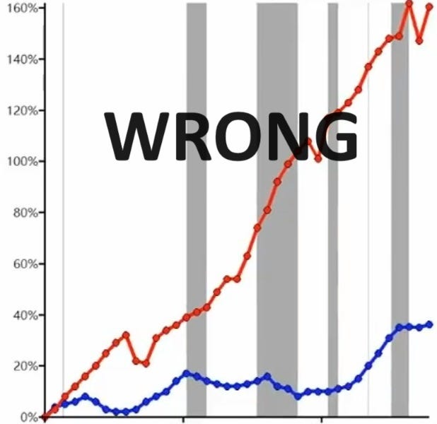
"Comparing an inflation-adjusted number to one that’s not adjusted can create a big gap between them over time."
"Median personal income actually went up more than rent since 1985."
Citater
"The art of any propagandist and agitator consists in his ability to find the best means of influencing any given audience." - Lenin
Vigtigste indsigter udtrukket fra
by Noah Smith kl. www.noahpinion.blog 02-26-2024
https://www.noahpinion.blog/p/how-not-to-be-fooled-by-viral-charts
Dybere Forespørgsler
How do misleading narratives attached to accurate data pose a greater risk than outright misinformation?
Misleading narratives attached to accurate data pose a greater risk than outright misinformation because they can persist for longer periods and become ingrained in public perception. When accurate data is presented with a narrative that twists its meaning or misinterprets the context, it can shape people's beliefs and decisions based on faulty premises. Unlike outright misinformation, which is usually debunked quickly, these misleading narratives can endure and influence policy-making, public opinion, and individual actions over time. The combination of accurate data with a distorted narrative creates a more insidious form of manipulation that is harder to detect and counteract.
What are some common red flags to look out for when analyzing viral charts?
Inaccurate Axes: Check the y-axis for truncation or non-linear scales that may distort the visual representation of data.
Dual-Axis Charts: Be cautious of dual-axis charts as they can be manipulated to create false correlations between variables.
Missing Data Points: Watch out for missing or incomplete data points that could skew the interpretation of trends.
Confusing Labels: Ensure clear labeling on both axes to understand what exactly is being measured in the chart.
Dramatic Changes: Be skeptical of charts showing extreme fluctuations or eye-popping statistics without proper context.
How can individuals protect themselves from being misled by deceptive visualizations?
Verify Sources: Always check the source of the data used in a visualization; government sources are generally reliable.
Understand Measurements: Take time to comprehend what each axis represents and ensure you grasp the units being used in the chart.
Sanity Checks: Conduct quick mental calculations based on common sense assumptions about trends shown in graphs before accepting them at face value.
Community Feedback: Look for community notes or fact-checking websites where others might have already debunked misleading visuals.
Critical Thinking: Engage critical thinking skills by questioning dramatic claims, checking for inconsistencies, and not blindly trusting viral content without scrutiny.
By staying vigilant, understanding key indicators of deception in visualizations, and applying critical analysis techniques, individuals can better protect themselves from being misled by deceptive charts circulating online or through various media channels."
0
