
Kirjaudu sisään
Introducing Heroicons Micro: A New Set of 16x16 Icons for Dense UIs
Keskeiset käsitteet
The author introduces the new Heroicons Micro, a set of 16x16 icons designed for higher density UIs to enhance productivity and visual balance in applications.
Tiivistelmä
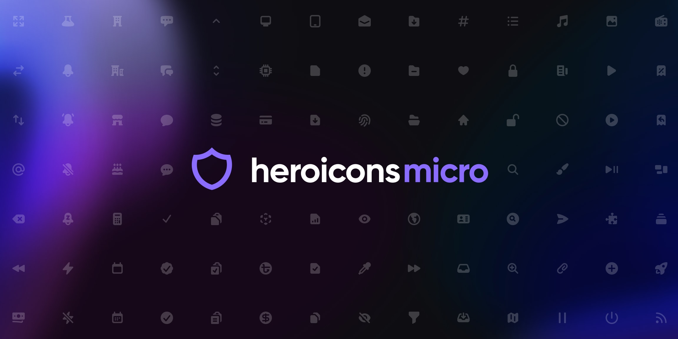
Heroicons v2.1 introduces a new micro style with almost three hundred 16x16 icons tailored for tighter, higher density user interfaces. The decision to create this set was driven by the need for icons that complemented the design aesthetics of their new React UI kit project, Catalyst. By meticulously redrawing each icon from scratch at the exact size they would be used, the team ensured sharpness and clarity in rendering for optimal user experience.
Mukauta tiivistelmää
Kirjoita tekoälyn avulla
Luo viitteet
Käännä lähde
toiselle kielelle
Luo miellekartta
lähdeaineistosta
Siirry lähteeseen
tailwindcss.com
Heroicons Micro: What are these, icons for ants? - Tailwind CSS
Tilastot
Heroicons v2.1 includes a brand new micro style with almost three hundred 16x16 icons.
The set of 288 icons was meticulously crafted for higher density interfaces like those in Catalyst.
Lainaukset
"Icons always turn out a lot sharper when you design them for the exact size they’re going to be used."
"We began the process of redrawing every icon from scratch, carefully trimming down the amount of detail on an icon-by-icon basis."
Syvällisempiä Kysymyksiä
How can the concept of designing icons specifically for their intended size be applied to other design elements?
Designing icons for their intended size is a crucial aspect of creating visually appealing and functional interfaces. This concept can be extended to other design elements such as buttons, typography, illustrations, and interactive components. By tailoring each element to its designated size within the interface, designers can ensure consistency in visual hierarchy, balance, and overall aesthetics. For example, when designing buttons, it's essential to consider the button's size in relation to surrounding elements and text to maintain harmony within the layout. Similarly, typography should be optimized for legibility at specific sizes to enhance readability across different devices.
What challenges might arise when implementing such high-density interfaces in real-world applications?
Implementing high-density interfaces poses several challenges that designers need to address effectively. One common challenge is maintaining visual clarity and avoiding clutter when incorporating numerous small design elements like micro icons into a UI. Ensuring that these elements remain distinguishable without overwhelming users requires careful consideration of spacing, contrast, and color choices. Additionally, optimizing performance becomes crucial as rendering a large number of intricate details on smaller scales may impact loading times and responsiveness.
How can incorporating these micro icons impact user engagement and interaction within different digital platforms?
Incorporating micro icons designed for higher density UIs can have a significant impact on user engagement and interaction across various digital platforms. These tiny yet meticulously crafted icons contribute to enhancing usability by providing clear visual cues that aid navigation and comprehension within an interface. The use of micro icons helps streamline information delivery by conveying complex actions or concepts concisely through recognizable symbols. Moreover, their crisp rendering at smaller sizes ensures optimal display quality on devices with varying screen resolutions, contributing to a seamless user experience regardless of the platform being used.
0
Tuotteet | Materiaalit
© 2024 by Linnk AI