
Sign In
Exploring the Intriguing Histories and Diverse Applications of Unique Typefaces
Core Concepts
Typeface selection can significantly influence the visual impact and emotional resonance of design, as exemplified by the creative use of the bold, serif-enhanced Permanent Massiv font on a classic album cover.
Abstract
The content explores the intriguing histories and diverse applications of unique typefaces, focusing on a specific example of the Permanent Massiv font.
The author discusses how the art director, Hy Fujita, collaborated with musician Rod McKuen to introduce serifs to the originally sans-serif Permanent Massiv font for the album cover of "Seasons in the Sun" (1974). This modification resulted in a magnified, staunch, and dressed-up appearance that significantly impacted the visual impact and emotional resonance of the design.
The author highlights the slightly stretched typography, tight and sometimes touching kerning, and the 'S' with serifs nearly piercing the middle of the glyph, which contribute to the distinctive character of the modified Permanent Massiv font. The author suggests that while this may not be a universally "good" or "bad" thing, it demonstrates how typeface selection can profoundly influence the overall design.
The content encourages readers to explore the intriguing histories and diverse applications of unique typefaces, potentially inspiring them to expand their personal font collections and consider the impact of font choices in their own design work.
Font finds: bold, elegant, and not just for memes
Stats
The font used on the "Seasons in the Sun" album cover is Permanent Massiv, a heavy sans-serif typeface.
The art director, Hy Fujita, collaborated with musician Rod McKuen to introduce serifs to the originally sans-serif Permanent Massiv font.
Quotes
"What happens when you add serifs to a very bold sans serif? Perhaps you may imagine the title designs of Knives Out, but have a look at one of Rod McKuen's album covers for 'Seasons in the Sun' (1974)."
"With its magnified presence seemingly bearing down on McKuen as he lies on the seashore, Permanent Massiv never appeared so staunch and dressed up."
Key Insights Distilled From
by Faux Icing at uxdesign.cc 03-08-2024
https://uxdesign.cc/font-finds-bold-elegant-and-not-just-for-memes-5e831ee05085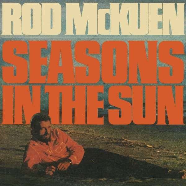
Deeper Inquiries
How might the use of the modified Permanent Massiv font on the "Seasons in the Sun" album cover be interpreted in the context of the album's themes or the artist's persona?
The use of the modified Permanent Massiv font on the "Seasons in the Sun" album cover can be interpreted as a reflection of the album's themes and the artist's persona. The bold and serif-ying nature of the font adds a sense of gravity and seriousness to the design, which could potentially align with the emotional depth of the songs on the album. The addition of serifs to a heavy sans serif font like Permanent Massiv creates a unique visual contrast that may symbolize the complexity and layers present in the music and lyrics. In the context of Rod McKuen's persona as an artist, the modified font choice could suggest a blend of strength and sophistication, mirroring his artistic style and depth of expression.
What other examples of unconventional font choices in album art or other design contexts can be found, and how do they impact the overall aesthetic and emotional resonance?
Unconventional font choices in album art or other design contexts can have a significant impact on the overall aesthetic and emotional resonance of the piece. For example, the use of a handwritten script font on an album cover may evoke a sense of intimacy and personal connection, enhancing the emotional appeal of the music. Similarly, a futuristic and sleek sans serif font choice in branding design can convey a sense of innovation and modernity, shaping the audience's perception of the product or service. In packaging design, a playful and whimsical display font can create a sense of fun and excitement, appealing to a younger demographic. These unconventional font choices not only differentiate the design from the norm but also contribute to the overall mood and message conveyed to the audience.
How might the principles of typeface selection and modification explored in this content be applied to other design disciplines, such as branding, packaging, or user interface design?
The principles of typeface selection and modification explored in the context of the Permanent Massiv font can be applied to other design disciplines such as branding, packaging, and user interface design to create unique and impactful visual identities. In branding, selecting a font that resonates with the brand's values and personality can help establish a strong brand identity and communicate the brand message effectively. Similarly, modifying a traditional font to add a twist or create a custom variation can set a brand apart from its competitors and make it more memorable to consumers. In packaging design, choosing a font that complements the product and target audience can enhance the shelf appeal and attract customers. For user interface design, selecting legible and visually appealing fonts can improve the user experience and make the interface more intuitive and engaging. By applying the principles of typeface selection and modification creatively across different design disciplines, designers can craft compelling visual narratives that resonate with their intended audiences.
0
Products | Resources
Read more
- 텍스트-분류를-위한-어댑터-모듈에서-성능-효율성-및-공정성의-균형-잡기
- autonomous-fixed-wing-aerial-vehicles-for-mapping-steep-alpine-environments
- 固定翼無人航空機による急峻な高山環境での自律的アクティブマッピング
- 고정익-무인항공기를-이용한-험준한-알파인-환경에서의-자율-활성-매핑
- adversarial-analysis-for-detecting-deceptive-social-bots
- 人工知能を利用したソーシャルボットの検出と分析
- 인공지능-기반-소셜-봇-탐지-기술의-적대적-분석
- efficient-spiking-neural-network-simulation-on-fpgas-using-high-level-synthesis
© 2024 by Linnk AI