
Sign In
Core Concepts
최근 폰트 식별을 돕는 과정에서 흥미로운 타이포그래피 역사를 발견했습니다. 개인 폰트 컬렉션에 새로운 멤버를 소개할 수 있는 폰트 발견 사례를 정리했습니다.
Abstract
최근 폰트 식별을 돕는 과정에서 저자는 흥미로운 타이포그래피 역사를 발견했습니다. 이 글에서는 개인 폰트 컬렉션에 새로운 멤버를 소개할 수 있는 폰트 발견 사례를 정리했습니다.
첫 번째 사례는 Permanent Massiv라는 굵은 산세리프 폰트에 세리프를 추가한 것입니다. 이는 Knives Out의 제목 디자인에서 볼 수 있는 스타일로, 1974년 Rod McKuen의 앨범 커버 "Seasons in the Sun"에서도 사용되었습니다. 아트 디렉터 Hy Fujita가 세리프를 추가하면서 Permanent Massiv 폰트가 더욱 강렬하고 정제된 느낌을 주게 되었습니다.
Font finds: bold, elegant, and not just for memes
Stats
1974년 Rod McKuen의 앨범 "Seasons in the Sun"에서 Permanent Massiv 폰트에 세리프를 추가하여 사용했습니다.
아트 디렉터 Hy Fujita가 세리프를 추가하여 폰트의 느낌을 더욱 강렬하고 정제된 것으로 만들었습니다.
Quotes
"What happens when you add serifs to a very bold sans serif? Perhaps you may imagine the title designs of Knives Out, but have a look at one of Rod McKuen's album covers for "Seasons in the Sun" (1974)."
"With its magnified presence seemingly bearing down on McKuen as he lies on the seashore, Permanent Massiv never appeared so staunch and dressed up."
Key Insights Distilled From
by Faux Icing at uxdesign.cc 03-08-2024
https://uxdesign.cc/font-finds-bold-elegant-and-not-just-for-memes-5e831ee05085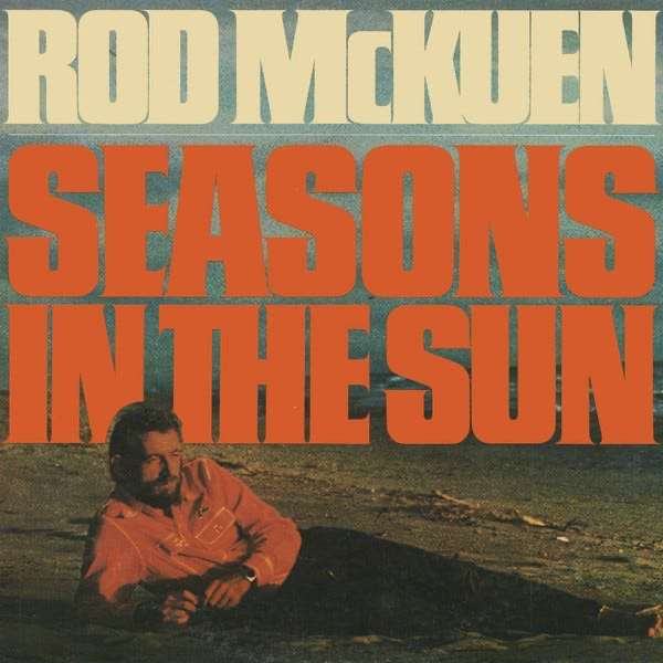
Deeper Inquiries
폰트 디자인에 있어서 세리프와 산세리프의 조합은 어떤 효과를 낼 수 있을까요?
세리프와 산세리프의 조합은 폰트의 미적 요소를 강조하고 텍스트의 가독성을 향상시킬 수 있습니다. 세리프는 글자의 끝에 작은 장식을 추가하여 글자를 더욱 섬세하고 우아하게 만들어줍니다. 이러한 조합은 텍스트를 눈에 띄게 만들어주고 글자 간의 구분을 명확히 해줄 수 있습니다. 또한, 세리프와 산세리프를 조합함으로써 글자의 강조나 감정 전달에도 도움을 줄 수 있습니다.
폰트 디자인에 있어서 아트 디렉터의 역할은 무엇이며, 어떤 방식으로 폰트의 느낌을 변화시킬 수 있을까요?
아트 디렉터는 디자인 프로젝트에서 창의적 방향을 제시하고 시각적인 요소를 조정하는 역할을 맡습니다. 폰트 디자인에서 아트 디렉터는 특정 폰트를 선택하거나 수정하여 원하는 느낌이나 분위기를 전달할 수 있습니다. 예를 들어, 특정 폰트에 세리프를 추가하거나 수정함으로써 폰트의 강조나 섬세함을 조절할 수 있습니다. 또한, 아트 디렉터는 폰트의 크기, 색상, 배치 등을 조정하여 디자인의 전반적인 느낌을 결정할 수 있습니다.
타이포그래피 역사에서 특정 폰트가 어떤 방식으로 활용되고 변화되어 왔는지 살펴보는 것은 어떤 통찰을 줄 수 있을까요?
특정 폰트가 타이포그래피 역사에서 어떻게 활용되고 변화되어 왔는지 살펴보는 것은 해당 시대의 문화, 기술, 예술적 추세 등을 이해하는 데 도움을 줄 수 있습니다. 폰트의 변화는 종종 사회적 변화와 연관이 있으며, 특정 폰트가 어떻게 사용되었는지를 통해 그 시대의 특징을 파악할 수 있습니다. 또한, 폰트의 발전 과정을 살펴보면 디자인 트렌드의 변화나 기술적 혁신에 대한 통찰을 얻을 수 있습니다.
0
Products | Resources
Read more
- 4次クリティカルな有向グラフにおける最小アーク数について
- 4-dicritical-지향-그래프의-최소-아크-수에-대한-연구
- understanding-generalization-of-over-parameterized-interpolators-using-distribution-dependent-pac-chernoff-bounds
- 過パラメータ化された補間モデルの一般化を理解する-pac-chernoff境界の活用
- 과적합-모델에서-일반화-성능-이해-pac-chernoff-경계를-통한-접근
- comprehensive-benchmark-for-evaluating-medical-anomaly-detection-algorithms
- 医療画像における異常検出のための包括的ベンチマーク-bmad-
- 의료-이상-탐지를-위한-벤치마크-bmad
© 2024 by Linnk AI