
Exploring Effective Use of Huge Type on Websites
Standalone Note here
The content delves into the effective use of huge type on websites through the analysis of different platforms. Connor Murphy's portfolio stands out with its daring approach to using Haas Grotesk in large sizes, ensuring a visually appealing design. InVision Careers page employs fluid typography and a unique formula to maintain font size consistency across screen sizes. Isabel Moranta's website opts for minimalistic design with Antiqua Roman font at 319 pixels, showcasing sophistication without breakpoints. GitHub introduces variable typefaces Mona and Hubot Sans, demonstrating precise sizing adjustments for visual harmony.
The key takeaway from the exploration is the recommendation for short titles when utilizing huge type on static marketing websites. While dynamic sites may face challenges with varying title lengths, the impact of large typography is most pronounced in concise headings that capture attention effectively.
Personalizza riepilogo
Riscrivi con l'IA
Genera citazioni
Traduci origine
In un'altra lingua
Genera mappa mentale
dal contenuto originale
Visita l'originale
matejlatin.com
How to use huge type on the web | Matej Latin
Approfondimenti chiave tratti da
by I M A Self-T... alle matejlatin.com 11-21-2022
https://matejlatin.com/blog/how-to-use-huge-type-on-the-web/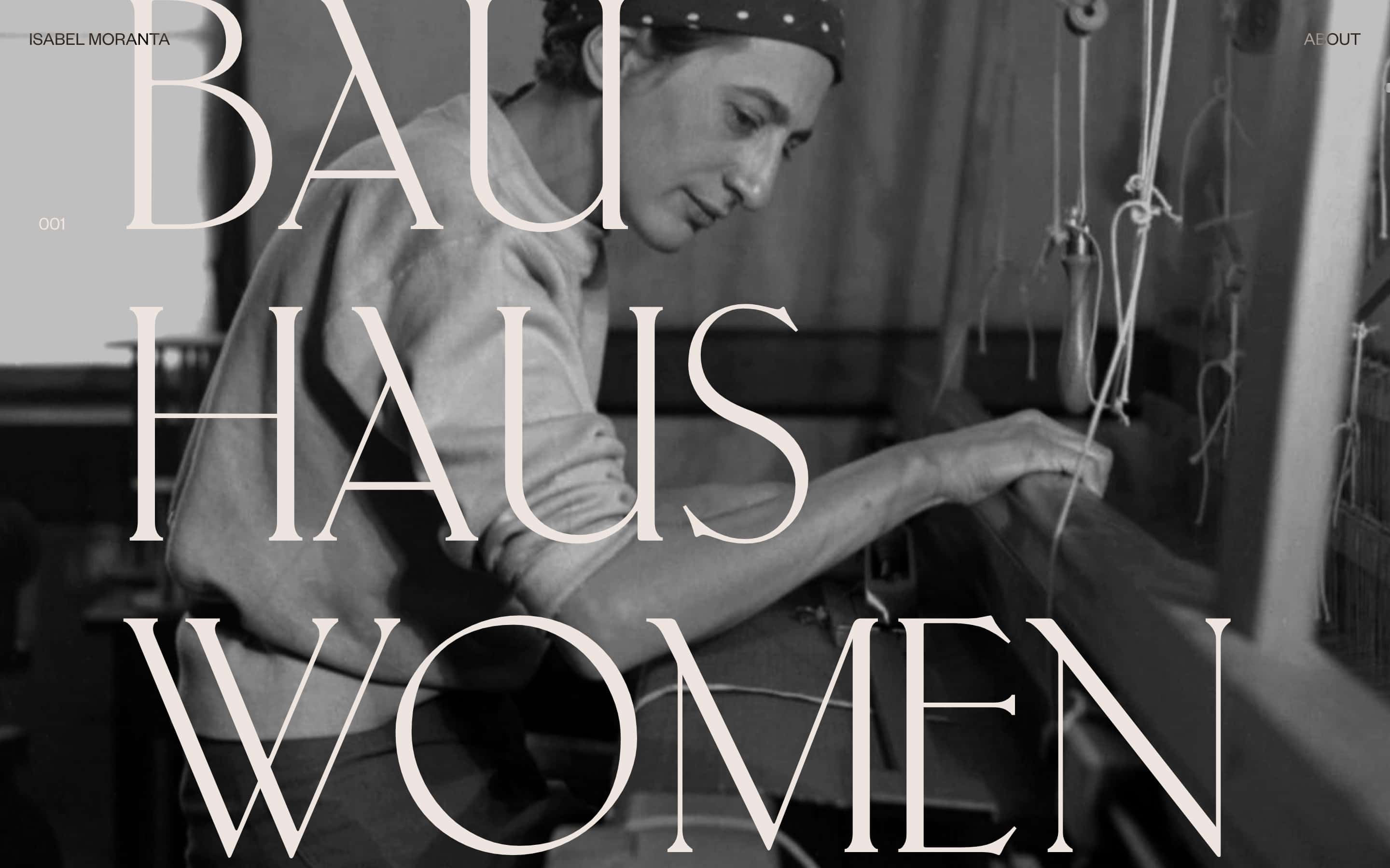
Domande più approfondite
How can dynamic websites effectively implement huge type given varying title lengths?
What are potential drawbacks or challenges associated with using huge type in web design?
How does font sizing impact user accessibility and readability online?
© 2024 by Linnk AI