toplogo
サインイン

Exploring Effective Use of Huge Type on Websites


核心概念
The author showcases various websites using huge type effectively, emphasizing the importance of short titles for optimal impact.
要約

Standalone Note here

The content delves into the effective use of huge type on websites through the analysis of different platforms. Connor Murphy's portfolio stands out with its daring approach to using Haas Grotesk in large sizes, ensuring a visually appealing design. InVision Careers page employs fluid typography and a unique formula to maintain font size consistency across screen sizes. Isabel Moranta's website opts for minimalistic design with Antiqua Roman font at 319 pixels, showcasing sophistication without breakpoints. GitHub introduces variable typefaces Mona and Hubot Sans, demonstrating precise sizing adjustments for visual harmony.

The key takeaway from the exploration is the recommendation for short titles when utilizing huge type on static marketing websites. While dynamic sites may face challenges with varying title lengths, the impact of large typography is most pronounced in concise headings that capture attention effectively.

edit_icon

要約をカスタマイズ

edit_icon

AI でリライト

edit_icon

引用を生成

translate_icon

原文を翻訳

visual_icon

マインドマップを作成

visit_icon

原文を表示

統計
176 pixels on a Macbook Pro screen. 156 pixels on my MacBook screen. 319 pixels on my MacBook. 245 pixels and 327 pixels respectively. -0.01em letter spacing reduction. 83% font-stretch property for Mona word, 75% for Hubot word.
引用
"It uses two breakpoints to scale the type to make sure it looks good on all screen sizes." "The authors wanted to match the width of the two words 'Mona' and 'Hubot'." "Isabel is breaking some rules here but she does it masterfully."

抽出されたキーインサイト

by I M A Self-T... 場所 matejlatin.com 11-21-2022

https://matejlatin.com/blog/how-to-use-huge-type-on-the-web/
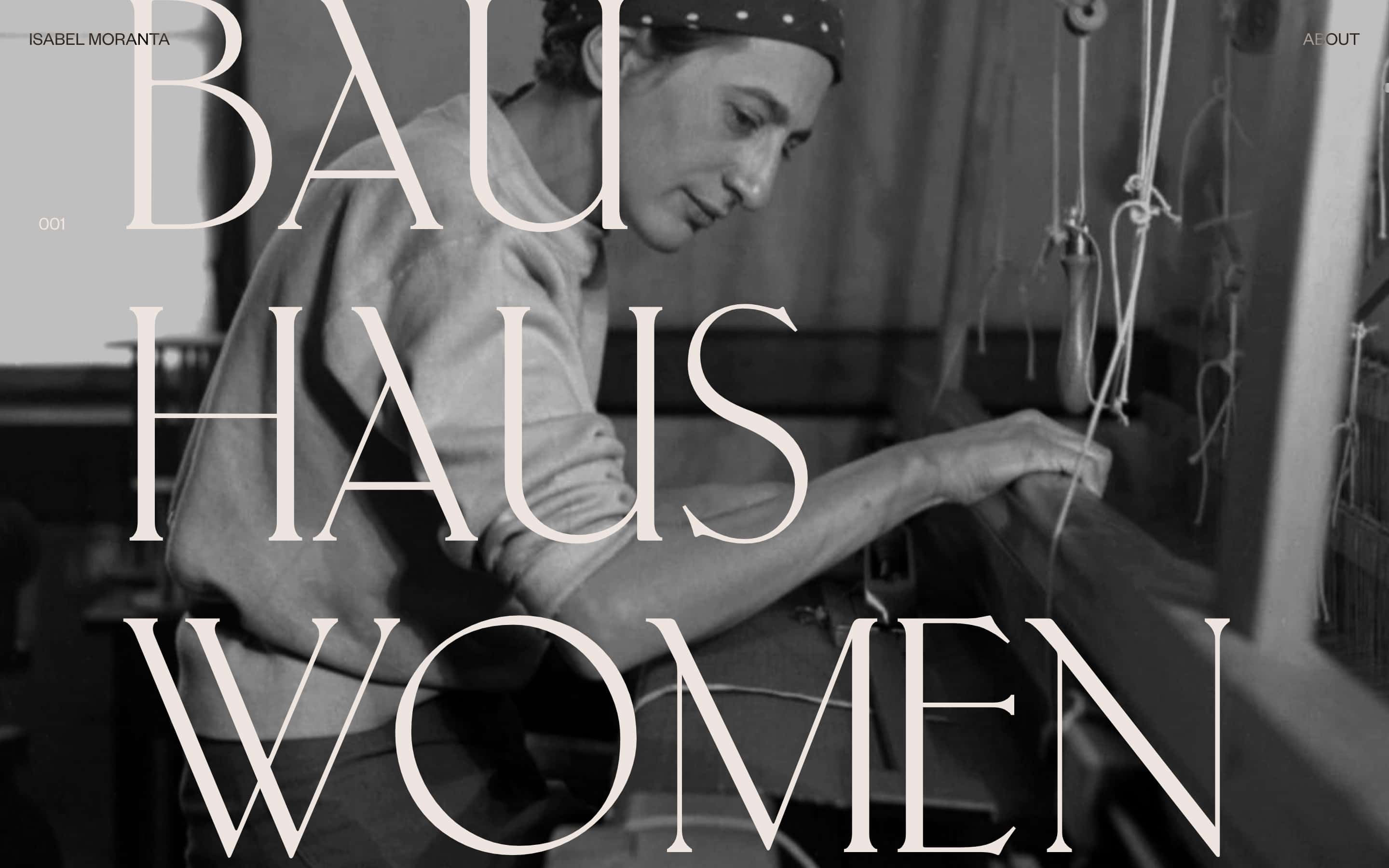
How to use huge type on the web | Matej Latin

深掘り質問

How can dynamic websites effectively implement huge type given varying title lengths?

Dynamic websites can effectively implement huge type by utilizing responsive design techniques. One approach is to set a maximum font size for longer titles while allowing shorter titles to scale up to the desired huge type. This way, regardless of the title length, it will still maintain a visually appealing and consistent look on the website. Additionally, using fluid typography that adjusts based on screen sizes can help in accommodating varying title lengths without compromising the overall design aesthetic.

What are potential drawbacks or challenges associated with using huge type in web design?

One potential drawback of using huge type in web design is readability issues, especially when not implemented thoughtfully. Extremely large text sizes may overwhelm users and make it difficult for them to consume content comfortably. Another challenge is ensuring that the layout remains visually balanced and cohesive when incorporating such prominent typography. Additionally, accessibility concerns arise as some users may have difficulty reading very large text or adjusting font sizes according to their preferences.

How does font sizing impact user accessibility and readability online?

Font sizing plays a crucial role in user accessibility and readability online. Properly sized fonts enhance readability by making content easier to scan and comprehend for all users, including those with visual impairments or disabilities. In contrast, inadequate font sizing can lead to usability issues where users struggle to read content comfortably or navigate through a website efficiently. It's essential for designers to consider factors like contrast ratios, line spacing, and responsive scaling when determining font sizes to ensure optimal accessibility and readability across various devices and user preferences.
0
star